Harley Davidson NYC - W³ Gold Award winner
All deliverables and artwork created at Born Group
Overview
Harley Davidson NYC was in need of a site redesign that would set them apart from other Harley dealerships and beautifully showcase their bikes and gear. I stepped in at the end of the Discovery phase to support the lead UX designer by taking on half of the project's wireframes as well as preparing functional annotations for our in-house dev team. The site is Responsive and is on the Magento ecommerce platform.
Discovery
Since I wasn't part of the Discovery phase I needed to do some independent research before diving into wireframing. I studied the brand, their current site, and competitor sites, as well as general motorcycle resources sites. I wanted to learn about the process of shopping for a bike and what information should be prioritized for users. I also wanted to think of interesting ways to present specs and make comparing bikes and accessing financing tools quick and easy.
Design
The brand had a lot of valuable content on their original site but there was no hierarchy in place highlighting important specs to users. In addition, the process of filling out forms to receive a quote or schedule a test ride did not follow best practices. I redesigned, edited, and applied best practices to all of their forms in order to make online tasks easier. I also created richer product pages for their bikes and gear to make them more emotionally impactful and exciting for users.
Wireframes
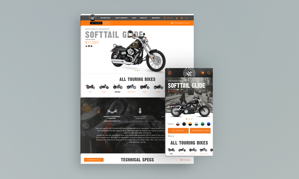
Bike Detail Page Screens and Variations
When everything is made to look visually important users are not sure where to focus their attention. The original bike detail page had a lack of hierarchy when it came to actionable items (get a quote, test ride, get financing, etc.). Making a distinction between primary, secondary, and sometimes tertiary actions provides visual guidance to the user and establishes proper hierarchy.
From talking to stakeholders and familiarizing myself with the process of purchasing a bike I zeroed in on the few key actions most users need easy access to and put those front and center. I took a similar approach to specs by prioritizing more critical content types and allowing users to compare different bikes with ease. I also included tutorials at the bottom to educate users on maintenance and care.

Gear Listing Page
The original site supported only merchandise and not actual riding gear. We wanted to provide the brand with a product listing page that will support more complex configurable products and a larger inventory.
I incorporated relevant filters, pagination, badging, and sub-category links to help users sort through items efficiently. With a “features” filter users can now filter by function (water proof, wind proof, venting etc.), which helps users find the jacket or boots that will enhance their riding, not just suit their aesthetics.

Gear Detail Page
The original product detail page included very minimal details because it only accounted for merchandise. Similarly to the redesigned product listing page, I wanted the PDP to intelligently talk to HD’s gear and provide users with relevant information.
I included notes about the materials & care, special features, fit & size, as well as a Complete the Look module at the bottom to cross sell complementary items.

Get a Quote Form
In order to make HD's forms more manageable, I first edited them down to include only essential information. I them applied best practices like placing the labels above the entry fields and keeping the forms in a single column format. I also divided longer forms to sections which allows users to see the type of information requested at a glance (lowers anxiety).

Final Designs
Visual designs were created by Jack Dixon and Claudeland Louis.

MOTORCYCLE DETAIL

GEAR LISTING

GEAR DETAIL

FORMS