KEEN

Agency: Domaine UX: Hagar Vander Design: Gerald Hastings & Fahad Asvat
Overview
KEEN is an American footwear and accessories company based in Portland, Oregon. They specialize in performance shoes for outdoor activities as well as for trade work. They came to us for a full redesign and re-platforming. I was the lead and sole UX designer on the project.
Discovery
I took over as UX lead towards the end of the Discovery phase (which sometimes happens in agencies). To catch up I watched all recordings of UX Discovery sessions and looked into requirements/marketing materials provided by KEEN.
Design
I was tasked with keeping the needs of various personas in mind as well as KEEN’s business goals. It was important for us to better communicate KEEN’s brand attributes (ethical, trustworthy, community-focused). It was equally as important to build a frictionless experience that helps users find the right shoes for the job.
Navigation
A few highlights:
Clearer organization: The original navigation mixed featured links (e.g., New Arrivals) with product categories (Socks, Accessories), making it harder to scan. My proposed IA separates these types so users can quickly understand each list and find the right category.
Simplified categorization: The original nav got overly specific (e.g., selecting by toe type), limiting users’ ability to compare products. I introduced broader global categories with more detailed filtering on the PLP.
Inclusive navigation: The original structure split Outside and Work shoes into separate global tabs, which could confuse users and force unnecessary switching. My approach unifies both audiences within one, more intuitive framework.
Clearer labeling: The KEEN Effect tab felt too branded and ambiguous. I recommended more descriptive naming to improve clarity and discoverability.
Consistent brand visibility: We added a brand and shopping benefits section to the footer so key brand messaging and value props are accessible from every page.

Product Listing Page
A few highlights:
Flexible PLP hero designs: We created different hero options for various use cases. More specific categories use a shorter hero image to keep products visible, while broader categories include a visual filter to help users quickly narrow their selection.
Collapsible filters: On desktop, users can collapse filters to see more products at once, giving them more control over how they browse.
Richer product cards: We added key features directly to the product cards, giving users helpful context beyond the image alone.
User-driven filter hierarchy: We refined the order and visibility of filters based on what users look for most, making the filtering experience more intuitive.

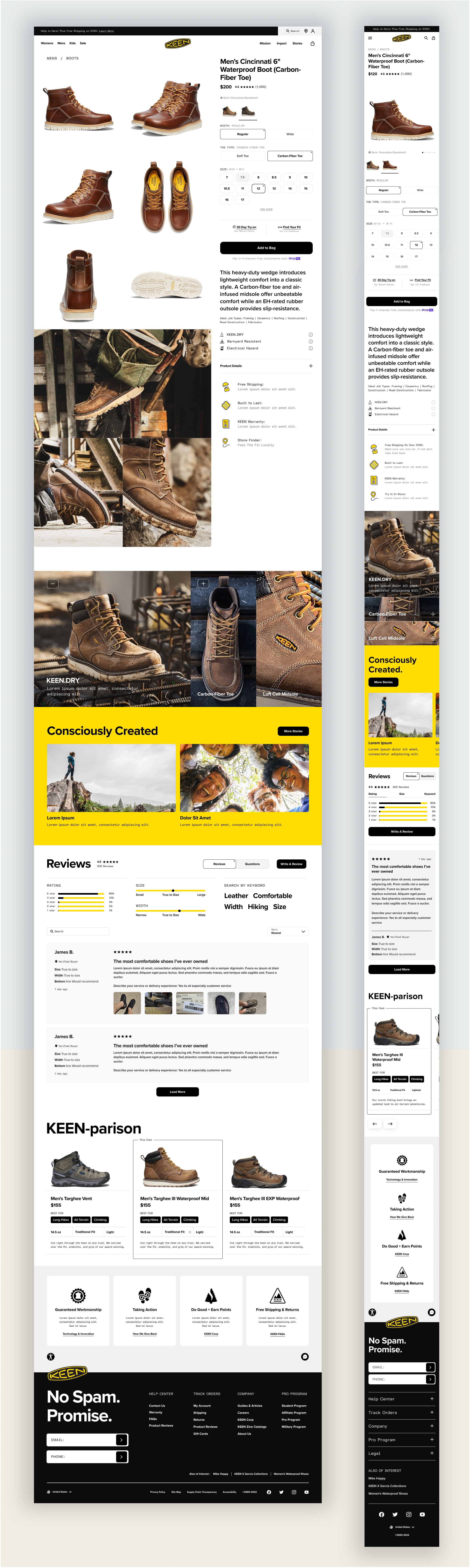
Product Detail Page
A few highlights:
Serving different users: The PDP was designed to support users looking for detailed specs like weight, materials, or reviews without having to dig, as well as those seeking a richer, in-store-style experience with dynamic imagery and storytelling.
Helping users find their best fit: Clear communication of product differentiators and fit guidance helps users identify what’s right for them.
Supporting decision-making: For users who reach the bottom of the page unsure about purchasing, we added “You may also like” and comparison modules to keep them engaged.
Flexible content modules: We built modular sections that can be mixed and matched depending on each product’s unique content needs.
Prioritizing relevance: I recommended placing global brand content below product-specific storytelling to ensure users first see information most relevant to their purchase decision.
Blog
KEEN wanted us to design and build a very custom blog on top of native Shopify functionality. To work through the blog’s structure and ensure we are all aligned I put together some high level visuals first. I then created more detailed wires that demonstrated how we are planning to handle and organize different content and media types.

