NOBULL

Agency: Domaine UX: Hagar Vander Design: Gerald Hastings & Sarah Wong
Overview
NOBULL, a Boston-based athletic brand rooted in the CrossFit community, partnered with Domaine for a full site redesign aligned with their “no bull” philosophy. I served as the lead and sole UX designer from discovery through launch and ongoing retainers.
Discovery
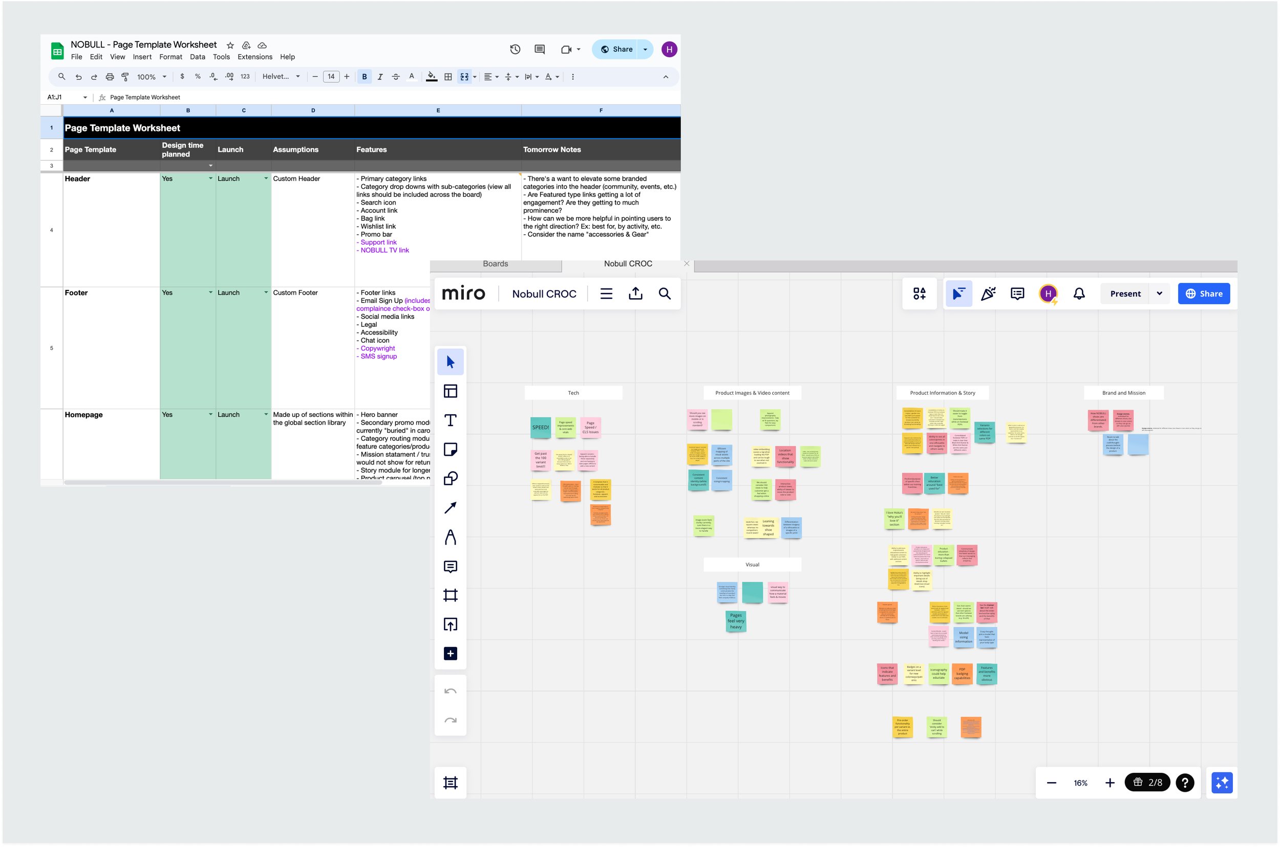
I led Discovery sessions to uncover user and business needs, ran a collaborative card sorting exercise focused on the PDP to understand the product line, and documented all features in a UX requirements doc before moving into wireframes.
Design
My focus was simplifying and clarifying choice for users (particularly beginners). I ensured each touchpoint provided the right level of information to help users differentiate between product categories without overwhelm.
Discovery
Primary takeaways:
Many users needed clear guidance and product education. We wanted to concisely answer questions like: “Why do I need training shoes vs sneakers?” or “What is the functional difference between the various models?”
In addition, each color/print was presented as a separate SKU on a PLP/PDP level. This made browsing cumbersome. We wanted to consolidate some of the swatches while still being able to show off the beautiful prints in collection pages
Navigation Research
I reviewed relevant analytics to ensure IA decisions aligned with user behavior.
I also analyzed competitor site navigation to understand user expectations and ensure NOBULL’s IA structure and naming conventions align with familiar UX patterns.

Wireframes
Recommended Navigation Approach
NOBULL’s original navigation included Trainer and Trainer+ links, which caused confusion for new users unfamiliar with the difference between product lines. I recommended replacing these with a single Training Shoes category to guide users to the right place first, then educate them further on the collection page.
The original nav also prioritized Featured links (New, Sale, Collections) over product categories. Based on analytics showing that category pages were far more popular, I reordered the nav to lead with product categories like Training Shoes and Running Shoes instead.
I introduced a Best For section so users could shop by activity as well as product type. This is particularly helpful for beginners who may not yet know which products best fit their sport or training needs.

Product Listing Page
I introduced a categorization module at the top that quickly outlines the important differences between styles. When users land on a very broad PLP this module can explain the difference between training shoes and running shoes as an example. When users land on a more specific PLP that same module can help users decide between Trainer and Trainer+ as an example.
I also included inline content cards for the PLP that can be used for education or to point users to relevant promotions.

Product Detail Page
I created a “Best For” module that in few words, explains to users exactly what a product does best.
Since NOBULL shoes are not inherently gendered (only difference is in sizing) I included a simple toggle enabling users to switch between men’s and women’s sizing regardless of the PDP they’re on.
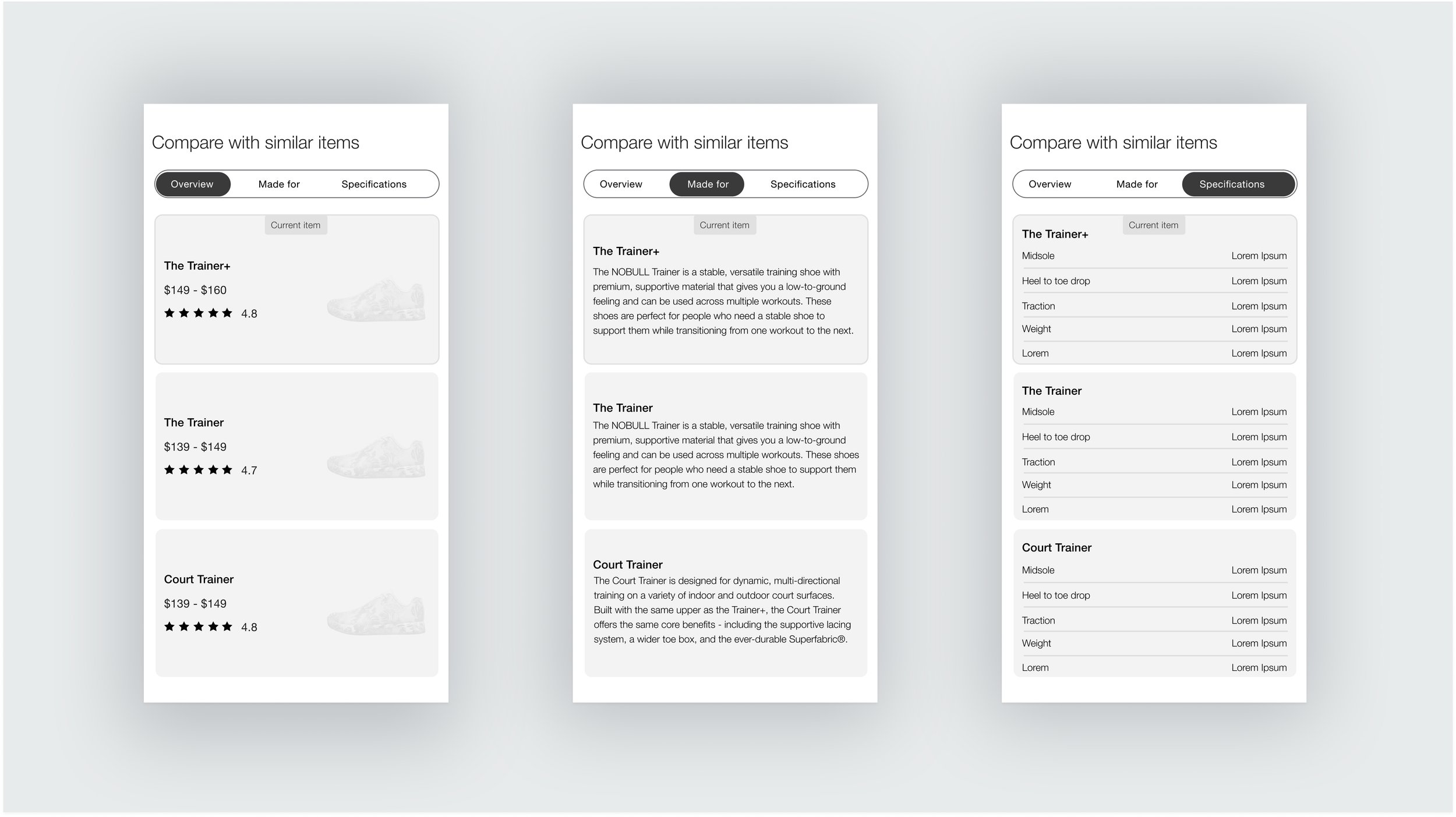
I also designed a comparison module to enable NOBULL to explain the differences between similar styles to be used towards the bottom of the PDP. This was meant to either affirm the user is in the right place or point them to a similar product better suited for them. From a UI perspective, we wanted all comparable info to fit within the viewport so users don’t have to scroll around on mobile to compare values.

Homepage
I wanted to move away from a traditional auto-rotating hero carousel knowing that it typically has poor performance and associated ADA issues. My recommendation was sticking with one hero story but have a secondary story slider below with the next story “peeking” to encourage engagement.
I wanted to offer ample flexibility in our categorization module with thematic tabs (Crossfit, Running, Golf, etc.) and optional copy to give context around each category.
I introduced sections meant to support longer form content revolving community, events, and influencer stories.

Retainer Relationship
I continued supporting this client post-launch with implementing new features and iterating on existing ones, as well as changes needed to support NOBULL’s exciting merger with Tom Brady’s TB12.