Astral Brands: PÜR
All deliverables and artwork created at Born Group
Overview
Astral came to us for a redesign of two of their skincare brands that will successfully tell their individual stories and offer users a rich and seamless shopping experience. The scope of work dictated that one set of wireframes will be created for our primary brand, meant to be shared by our secondary brand. I was the lead UX designer on the project, creating all deliverables for PÜR, our primary brand. Both sites are responsive, and are on the Magento ecommerce platform.
Discovery
After conducting a Gap Analysis to determine which templates cannot be shared in order to add those to our scope I lead three sessions of Stakeholder Interviews with various key members from Astral. I then created a Feature Value Matrix detailing functionality that was included in the SOW and features that came up during the interviews. The document was a collaborative effort between UX, dev, and the client. These first few tasks allowed me to arrive at a final Template Inventory and Site Map.
Design
During the design phase I aimed at creating wireframes that could be reused by the secondary brand but at the same time recognize where the two brands depart and need unique treatments. In collaboration with the visual designer on the project we worked at creating interesting interactions throughout the site that would simplify and "gamify" the user's experience. Especially for Makeup categories, we wanted to allow users to explore texture, color, and get the right information at the right time.
Discovery
Stakeholder Interviews
Having a formal interview guide, and sometimes sharing the guide with the client in advance, help steer the conversation back to a productive place if needed. It also serves as a checklist to make sure all important questions are answered.


Feature Value Matrix
A feature prioritization exercise meant to collaboratively decide which features are part of the initial launch.

Template Inventory
This document lists all templates to be designed, as well as reference letters that correspond with the site map. This helps the client see how templates will be used and repurposed throughout the site.

Site Map
Below is a sample from the site map document detailing our drop down menus. At the top of each page I included a simple graphic illustrating what terms like “drop down menu” or “utility navigation” mean and where different navigational elements are traditionally located. I find that not all team members on the client side necessarily know these terms and a simple graphic can help them visualize the site map in context.

Design
Wireframes
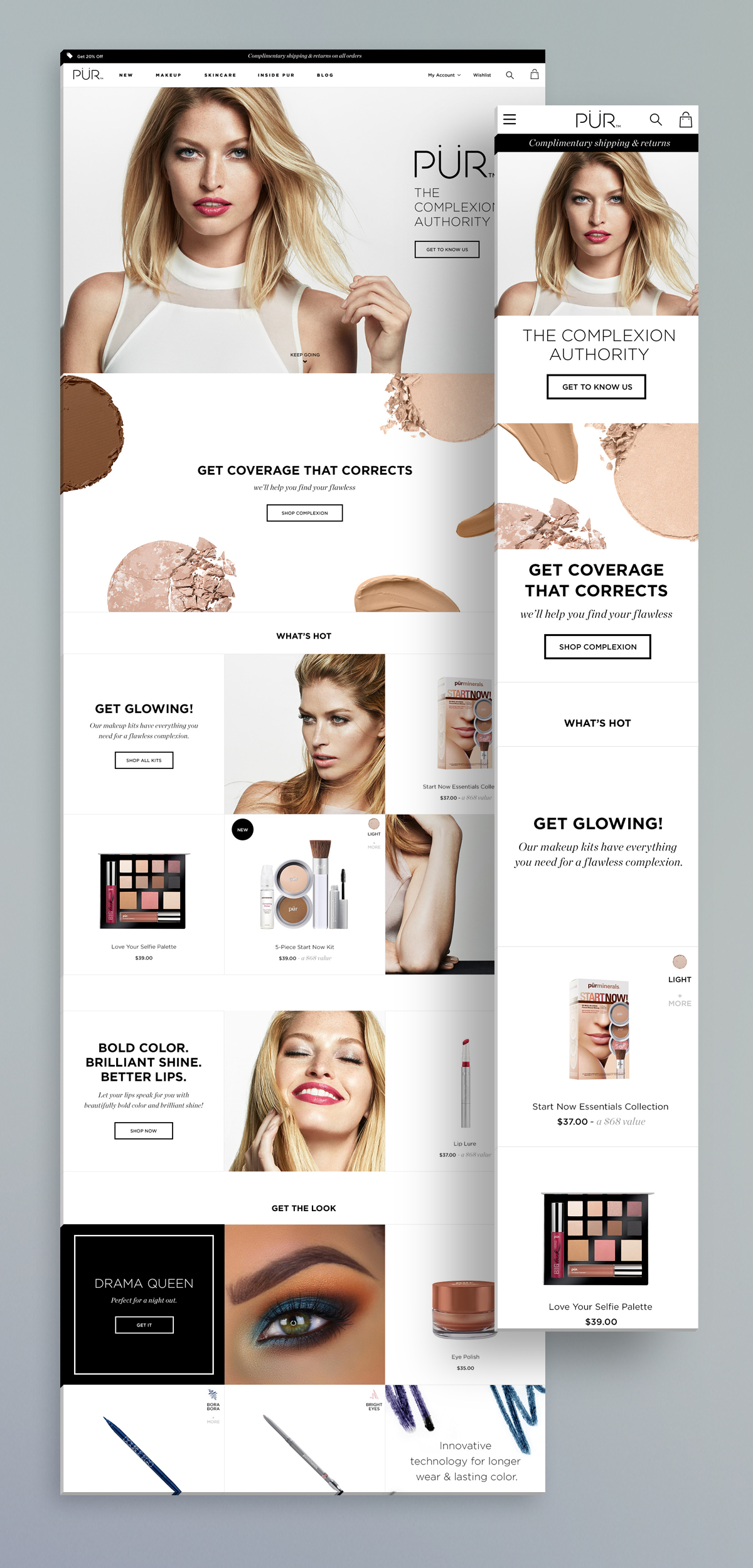
Homepage
Instead of using traditional promo banners we created 2,3 and 6 slot module variations throughout the site. Each module talks to one promotion, product, or category. This approach allows the brand to turn a flat promotion into a story telling opportunity where they can insert bits of information about their products or deconstruct a look/routine for users. The grid also easily scales down responsively.
In order to keep the experience informative, rich, and fun, product tiles anywhere on the site show a beautiful texture shot of that product on hover as well as swatches of any available shades for the user to interact with.

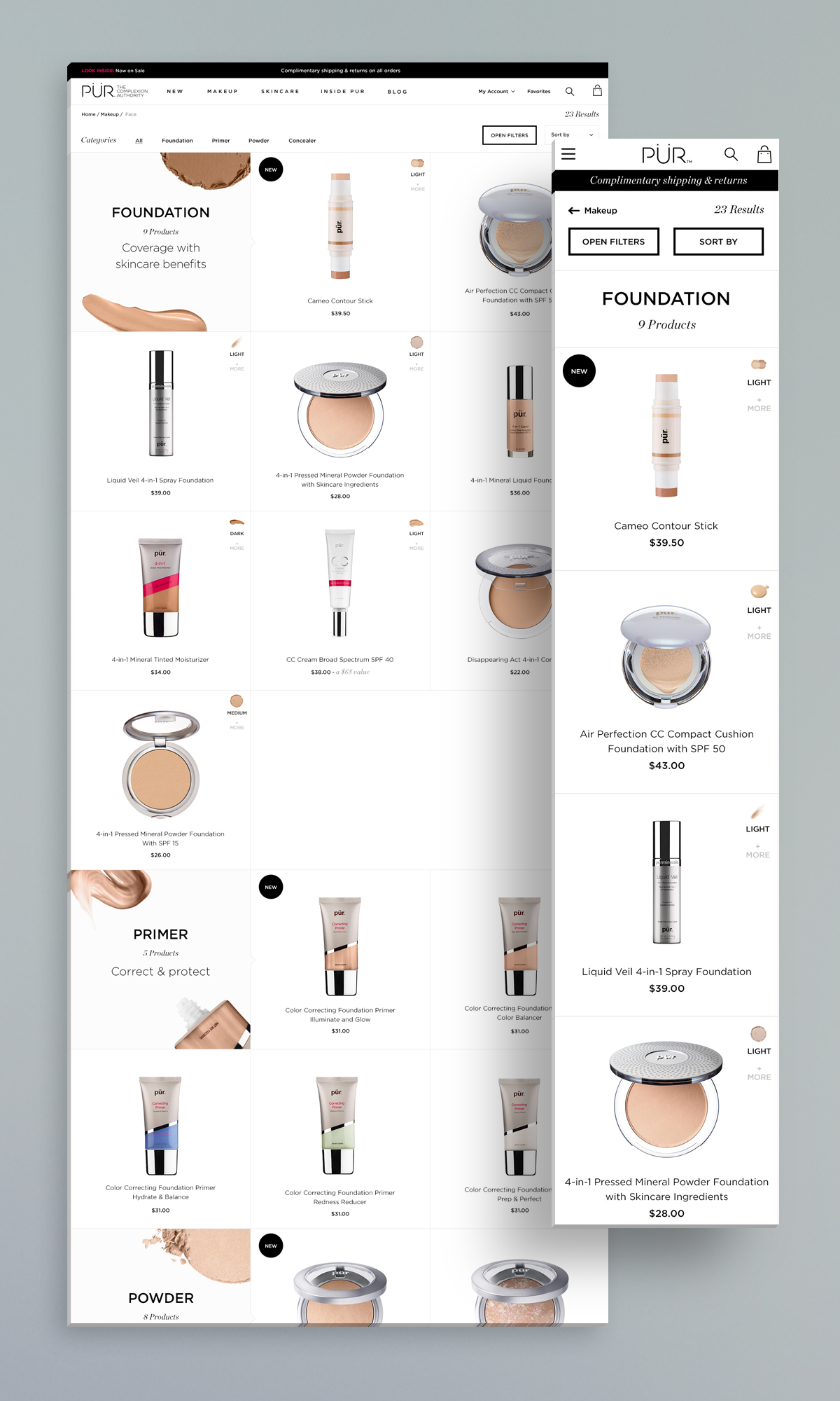
Listing Page
Categorization in the original Pur site contributed to mostly empty listing pages featuring a handful of available products upon landing. This experience can potentially be a dead end for users and structurally isn't the best solution for a brand that has a small inventory. In my suggested navigation I dialed back categorization by one level which makes sense for Pur’s inventory size and allows for cross selling. This structure still offers easy product category refinement at the very top of the page for users who know exactly what they are looking for.
All filters (Open filters shown at the bottom) are under one menu and dynamically update after users make a selection. The Shade Finder portion was designed to align with how shades are treated in Pur’s educational materials. Each shade has an undertone associated with it which can help users choose between two similar shades more easily.

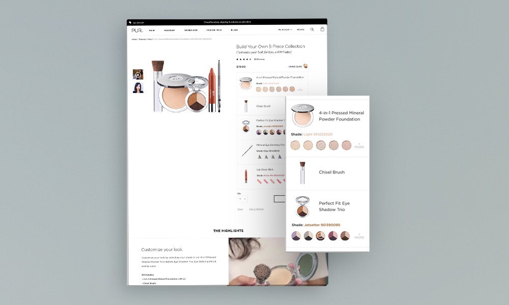
Product Detail Pages - Standard, Group, and Bundle
Throughout all PDP variations we are using large and detailed swatches to display our shades and highlight a Shade Guide link to make the matching process straight forward.
The original Pur site kept all product information tucked away in tabs. Users couldn't easily access product highlights and had to read through long paragraphs of copy to get a solid grasp of what the product does. There was also no balance between copy and images to make this information more digestible. I pulled out an introductory description from the tabbed section to offer users an introduction by default as well as a video tutorial. I used iconography and imagery to make it easier and scannable for users to understand the benefits and use instructions.
The Over Under module was our take on the You May Also Like standard. We believe that showing products as part of a routine instead of displaying a dry list of products lacking context would be more effective for our users. To accommodate routines, looks, and kits I created additional PDP variations (Group and Bundle).

Final Designs
Visual designs were created by Jamie Sheriff.

QA
I performed QA on the site prior to launch to identify issues and tighten the experience from an interaction standpoint. Daily scrums helped maintain communication between the different teams during development.